
By now many of us know that the logo of a company is one of its most intrinsic properties.
There are numerous companies who prefer to have their logos redesigned, or improvised at certain intervals of their journey for a quality brand refresh. This also creates an interesting stir in the market amongst the stake holders, especially their target customers. Moreover, such activities also help companies to gain new and young customers.
From 2018 and onwards, numerous globally renowned companies have changed their brand logos.
However, in this post we will only cover those names who have made commendable and worthwhile changes in their logos.
David Brier, author of brand intervention
If you don’t give the market the story to talk about, they’ll define your brand’s story for you.

Let us quickly jump to the point and explore the great logo resets of 2022 and 23
LG
LG has come up with the Flat colour version of their 3D finish Logo. Also, the base colour has changed from from burgundy to scarlet red. Nice, as this has given the brand its required measure to maintain a controlled colour calibration in print media.
Castrol
BP Group brand Castrol has improvised its logo with incorporation of curves in place of straight lines, but maintaining its original look. Castrol being an energy brand, this change has been appropriate for them, as the logo visually suggests smooth flowing of their lubricants for the engine and motor parts. The brand has also changed the typeface from narrow, tall features towards more round characters. The shade of green used in the circle carries a lighter tone, giving a brighter yet soothing look.
Nokia
Nokia has completely changed their logo, for the first time in 60 years. The typeface is far away from its typical heavy look, more into edgy and thinner style. And the biggest difference is that they have omitted their tagline “Connecting People”. As a brand management professional, it is my experience that, good brands and their logo stand alone, without the help of any tagline. So, Nokia’s new logo is displaying its confidence!
Citroen

The French Automobile manufacturer Citroën also revamped their logo, replacing the previous one with their first brand identity that was created back in 1919. How amazing that is! Only deviation is the height of the ellipse that contains the upward facing chevrons. Also, for their typeface family, Citroën has applied a scientific look to their word mark, where all the letters are carrying similar width, almost. Thus communicating a calm and a steady message.
Burberry
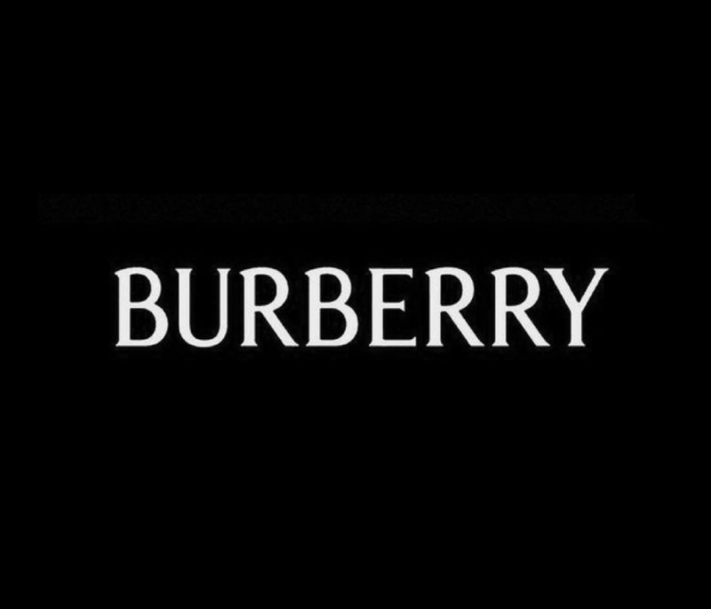
Burberry has successfully stood as one of the greatest luxury brands in the world. Their brand identities have mostly carried Serif Typefaces from the beginning, until 2018, when the company adopted a Sans Serif Heavy look. This might have been done to show their competitive trait during the race of constant change. However, Burberry has once more brought back its Serif look, which is thinner and smarter than all its previous logos.
Morphy Richards
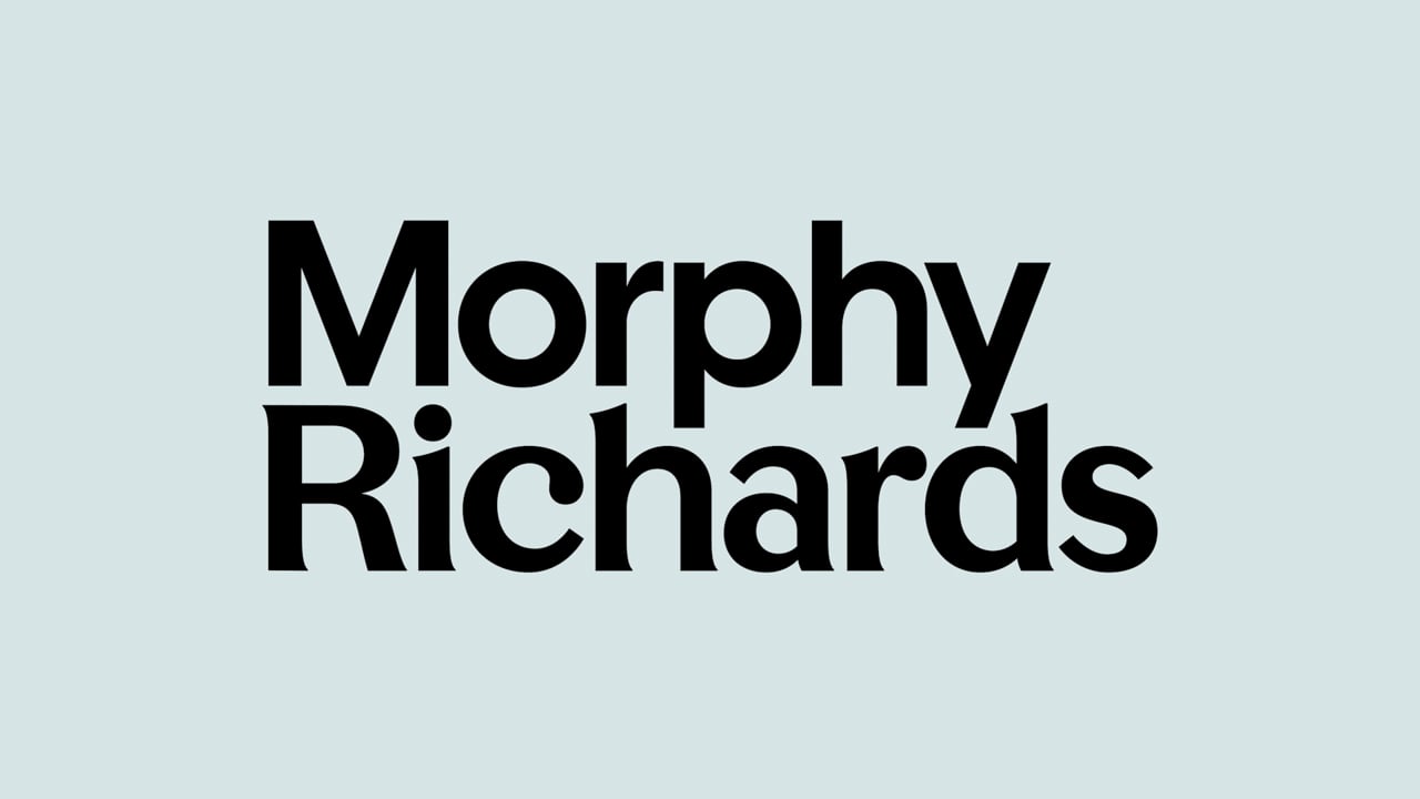
Morphy Richards, a British electrical appliances company, always had a friendly yet bold look, for its logo typeface and the colour red. Now, the brand has transformed its complete visual identity with a Matured appearance, with a new word mark that has a colour combination of Light Teal and Black, with slight Serif finish.
The time that we are passing through, has been demanding constant change of design for almost every industry and company type. That’s one perspective to look at. This also unveils the truth that good design is timeless and such insights have been covered in this post, where companies have either been using one logo or similar styles for more than a decade or are going back to their original states after a while.
Let us know your opinion in comments, below.
0 Comments