Helvetica – Helvetia
Swiss make commodities are usually one of the best in class. Especially, all watch manufacturers from Switzerland have rolled out brilliant timepieces, which have always held a live-cycle value.
Every second that the hand ticks, seems to be accurate with much precision that makes the liveable time precious. However, the irony is, every product faces physical depreciation eventually, which is very obvious and natural. Nevertheless, in contrast to wearing off of elements, one Swiss made product has actually stood the test of time. HELVETICA – the typeface.
The typeface:
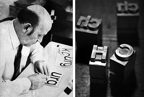
Neue Haas Grotesk (New Haas Grotesque),
was its inventive name & later that was christened into Helvetica,
which in Latin is similar to Swiss.
Helvetica is a sans-serif font developed in 1957 by a Swiss typeface designer Max Miedinger with guidance from Eduard Hoffmann. I am astound to realise that Miedinger was such a visionary, that his creation gained global grandeur almost immediately after it came into the market! This typeface was an inspiration from renowned Akzidenz-Grotesk and other German and Swiss typography designs. Helvetica is an unusual typeface that comes without strokes on vertical and horizontal lines of a font, and also its appearance is much compact compared to the others. In due course, considering different weights, widths, sizes, an extensive series of variants for Helvetica has been designed and developed.
Rise of Helvetica:
Over the years, the extensive use of Helvetica became the hallmark of International Typographic Style and had been one of most predominant letterings of the 20th century.
Innumerable companies have used Helvetica as their logo font styles. To name a few:
| Agfa American Airlines American Apparel BASF BMW Baskin & Robbins Blaupunkt British Gas Burger King Caterpillar Crate & Barrel Dole Ducati Energizer Epson | FENDI GM Havells Harley – Davidson Hitachi JC Penney Jeep Kawasaki Knoll LG Lufthansa M&S Mc Donalds Microsoft Motorola | Muji NARS NASA Nestle Oral-B Panasonic Paramount Pictures The North Face Scotch 3M SAAB Sanyo Skype Standard Chartered Staples | Subway Suzuki Target Toyota Tupperware Verizon World Trade Center Yahoo |
Helvetica for the Government:
From transportation to stationeries, this sans-serif font has become a shape of lettering that we love.
Major government bodies have used Helvetica for their foremost undertakings, viz.:
- British Railway System,
- British Airport Authority,
- Canadian government’s corporate identity program,
- Madrid Metro,
- NASA Space Shuttle orbiter,
- New York Metropolitan Transportation Authority (MTA),
- Philadelphia’s Southeastern Pennsylvania Transportation Authority (SEPTA),
- US government’s federal income tax forms,
- US television rating system,
- Washington Metro, the Chicago ‘L’.
Helvetica in Media & Communication:
Helvetica is a modern typeface and its usage goes beyond logo design. The profile of Helvetica is such that it forms an identity itself, thus providing a robust image to an entity who prefers using this typeface for its media and communication, also, viz:
- BMW has Helvetica for its brand font.
- CDE Global Ltd. has chosen Helvetica Neue as its brand font.
- Glasgow Caledonian University’s scholarship application dashboard portal content is done using Helvetica.
- Istituto Marangoni uses Helvetica in its communication collateral.
And many more to say…
For the Love of Helvetica:

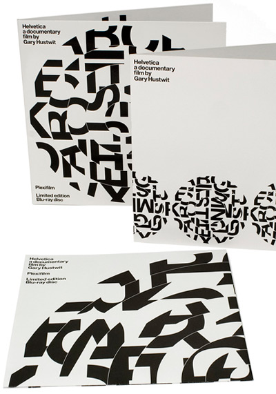
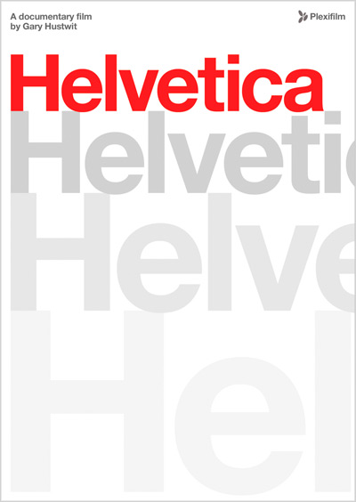
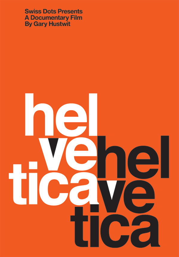
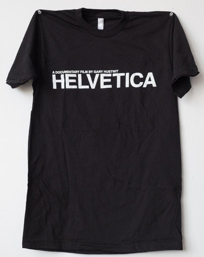
- Gary Hustwit filmed a design trilogy that started with Helvetica as the first documentary of the series.
Mention of the typeface – Helvetica was intended to hold high the importance of lettering, graphic design and universal visual culture.
Numerous marvellous merchandise were also developed for promoting this documentary. - Mondaine Swiss Watch Company has an edition called Mondaine Helvetica, which caters four variations of wrist watches with names of Helvetica No 1 light, Helvetica No 1 regular, Helvetica No 1 bold & Helvetica 1 Smartwatch.
- Travel Mugs, T-Shirt & other stationaries have come into existence after Helvetica surfaced.
Watch Helvetica for realising the significance of this typeface.


0 Comments