Some brands evoke aspiration, even outside the realm of luxury. The Big 4 Consulting companies give you this experience, and PwC is one among those.
I started my career in 2010, as an analyst with PwC India, in their document services department under Advisory wing, which now comes under PwC Service Delivery Centre. Back then, the firm was popularly addressed as Price Waterhouse, and their identity featured:
An all-caps word logo: PriceWaterhouseCoopers
An abbreviated icon: PwC
After spending a couple of months with the company, around September 2010 there came a big announcement of renewal – their new brand trademark, and it carried four major changes.
They officially shortened their trading name to PwC, while legally remained PriceWaterhouseCoopers. So, the word logo was removed and the abbreviation stayed.
The new logo written in lowercase: pwc
The typeface changed into a heavier form, retaining its Serif family.
Introduction of red, tangerine, and pink pixels above the abbreviation.
This change was disruptive in a good way and visually rich to the internal and external stakeholders. For us in Document Services, it felt like shifting worlds much like Dr. Strange navigating dimensions in the Marvel universe. Detailed and new brand guidelines, and the enthusiasm in all the 240 team members of our department, to unlearn the old and embrace the new branding rules. This change was enticing for us, as we were the backbone of brand formatted files that went out to the public from PwC. That newness rapidly became our normal and changed the way I looked at branding.
15 years later around April 2025, PwC brought another brand design revamp, through a campaign called “So You Can”, which gave the global stage an even more minimalistic logo. This new look replaces the multi-colored pixels with two orange bars, which are called the “momentum marks”, that convey the traits of being bold, collaborative and optimistic. The new brand identity reflects PwC’s ever evolving, powerful technology-driven and unwavering focus on its clients, especially in today’s world where the future is pacing fast to our present. To signify their new philosophy, PwC becomes F1’s official consulting partner.
There are many thoughts afloat amongst brand influencers, about this new logo. And I believe that the New Symbol is Absolute, as it brings forward minimum alteration and only two colors, that rightly conveys clarity given the current state of uncertainty with the sudden surfacing of AI and its application in various sectors. Big 4 companies have always played pivotal roles in decoding every industrial revolution. Having simple crisp logo, now, is need of the hour, to channel confidence in consulting, services and across industries, and devolve promise of consistency down the pyramid, since transparent information, equality and inclusiveness are being woven into the corporate fabric, much more than before.
Brand consultants Wolff Olins have created both versions of this logo, previous and present. The first version that got released in 2010, took 2 years to process the transformation in collaboration with PwC employees and clients.
As someone who lived PwC’s first wave of change in 2010, I see the 2025 revamp as a continuation of PwC’s commitment to clarity, confidence, and future-readiness.
In the span of a single week, the world bid farewell to two extraordinary visionaries—Sumit Mazumder, on 31st August 2025, the former chairman of TIL Limited from Kolkata, India, and Giorgio Armani, on 4th September 2025, the timeless maestro of fashion from Milan, Italy.
Though their worlds were vastly different, their legacies echo a shared truth: excellence, when pursued with heart and vision, leaves a mark that time cannot erase. Greatness, therefore, remains.
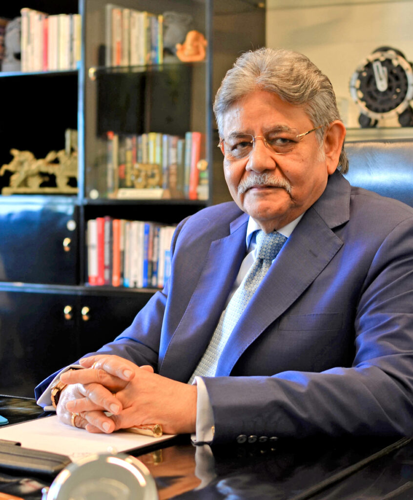
Sumit Mazumder
TIL Limited, also known as Tractors India, was founded in 1944, was one of the first primary dealers of Caterpillar, established during India’s journey toward independence and infrastructure development. Over time, TIL grew into a prominent corporate entity in the country.
In 1995, Sumit Mazumder (popularly addressed as SMR) took over as the Managing Director. Under his leadership, the company expanded its production facilities and gained global exposure through partnerships with brands like Manitowoc, Hyster, Astec Industries, and others.
Although I did not have the privilege of knowing SMR Sir personally, I’ve heard from former employees that he was a great listener and extended a helping hand to those in dire need. Known as a fierce entrepreneur, he also had a refined taste for heritage luxury.
During my tenure at Tractors India between 2014–2016, I once had the opportunity to witness the marvels of his curio collection when I was invited to his office to photograph him for an official article. It was just a few moments, and I was nervous while aiming my camera. But SMR Sir’s composure unknowingly steadied me, and I managed to capture two great photos of him.
We come across many people—some common, some stalwarts, never realizing that those brief interactions will remain etched in our memories, only to surface when death completes a life.
Greatness, therefore, remains.
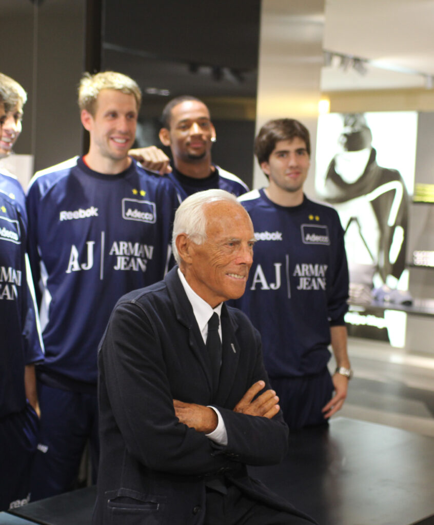
Giorgio Armani
“War taught me that not everything is glamorous.”
Giorgio Armani was a child during World War II. One day in Piacenza, he was playing with undetonated artillery shells. One exploded—killing a friend and badly burning him. This incident shaped his lifelong pursuit of elegance – not as vanity, but as healing and order, because good design demands great discipline. Despite having no formal design training, Armani became one of the most revered designers in the world. His mastery came from observation, experimentation, and intuition—something every designer should learn from.
Giorgio Armani was an era unto himself.
In 1975, Giorgio and his partner Sergio Galeotti formed Giorgio Armani S.p.A. Giorgio’s philosophy and work led Italy out of the black-and-white of political violence into a world of taste and tradition. He made “Made in Italy” a global statement of elegance and timeless design.
Since 2012, his designs have adorned the Italian Olympic team—and will continue to do so at the 2026 Winter Games in Milan-Cortina. Again, greatness remains.
A Curious Coincidence
Both men shared the same birth date – 11th, Sumit Mazumder on 11 February 1948, and Giorgio Armani on 11 July 1934. Finding this coincidence intrigued me and led me to read more about them. And that’s how you’ve reached the end of this reflection.
Alternatively, as the world of business is full of negotiations and commerce, being graceful about oneself brings an absolute satiety to motivate ourselves for the next morrow.
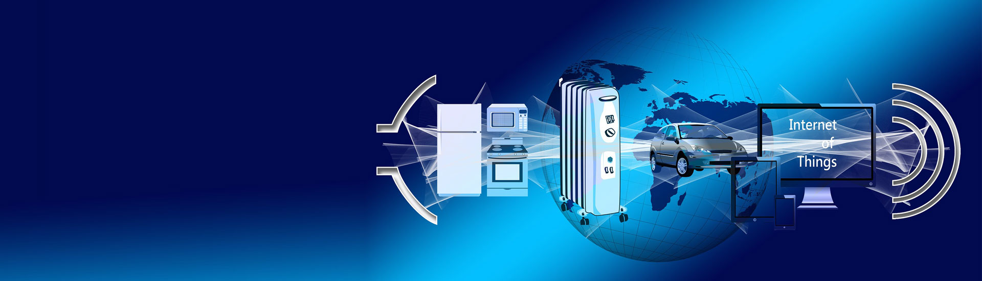
On an average, we spend one third of our life at work, which sums up to 90,000 hours.
It is important for us to have a good working environment, as that adds to our physical and emotional well being. However, such measures are only accessible while we are present within the company’s office and workshop premises. With increasing population and their ever growing demands for commodity and services, multiple companies are formed each day, to meet market needs. This gives us a large pool of employment, where different size and kind of companies recruit eligible candidates.
Statista reports, that, about 334 million (33,40,00,000) companies are there, worldwide, and counting. Approximately 60,000 of them are multinational corporations, who control over 5,00,000 subsidiaries, as reported for 2021 by Espace Mondial.
A Brief Account of Office Landscape
During 1940s and 1950s, majority of the offices in Europe had a sense of hesitation, due to the devastations from WWI and WWII. But, the post war period saw Germany emerging as a fast growing nation, with advancements in manufacturing and office facilities, covering their ruthless past. Their thought processes transformed Taylorist workplaces into Burolandschaft designs. This made companies adapt to fluid non-hierarchical layouts. As a result there was increase in communication, collaboration, and productivity among the employees. Eventually this concept made its way to the UK and the USA in 1960s. Around this time in America a similar but more personalised open layout concept surfaced – the Action Office, which gave adequate privacy among the senior officers and a sense of respect across the hierarchy. Although, cubicles replaced some portions of the Open Office layouts, that was a brief account of what we commonly see in our present office spaces.
However, building a great place for your employees to work in, goes much deeper than just designing office landscapes. With industrial and commercial reforms, sanity, and humanitarian grounds at play, many companies have been giving sincere thoughts and efforts in establishing great work culture.
A Harvard Business Review article suggests that there are six most essential parameters for companies to create perfect working environment for their employees.
1. Let people be themselves 2. Unleash the flow of information 3. Magnify people’s strengths 4. Stand for more than shareholder value 5. Show how the daily work makes sense 6. Have rules people can believe in
These parameters help organisations in many ways:
To attract and retain talents
To maintain customer centric mindset
For growing the business bottom-line
To maintain agility is business operations
To develop a culture for innovation
To reward professional excellence
To project your business as a high quality employer brand
To earn recognition at national level and beyond boundaries
While serious companies got busy culturing and implementing these parameters in their businesses, one particular organisation rose into prominence. Great Place to Work®.
They partner with the most successful companies, across the globe and help them in creating the perfect workplace.
Formation of Great Place to Work
In 1981, a New York editor asked two journalists Robert Levering and Milton Moskowitz, to write a book named “The 100 Best Companies to Work for in America”. Through their research it was discovered that the key element of building great companies for people to work, is having these interconnected set of values:
High-quality relationships in the workplace.
Relationships based by trust, pride and camaraderie.
This book was released in 1984, and with the same values at its core, its sequel was published in 1988 “A Great Place to Work®: What makes some employers so good and most so bad”. This exercise led to the formation of the institute, which was named after the book itself – “Great Place To Work®.
There are four major steps, followed by Great Place to Work® to evaluate companies:
Step 1: Trust Index Employee Survey
Step 2: Culture Audit – People Practice Assessment
Step 3: Getting Certified on meeting the qualifying criteria
Step 4: Obtain Actionable Insights to build a Winning People Strategy
This financial year, over 5,200 companies have been evaluated and certified by Great Place to Work, in India alone.
31 Mega-size Organisations have been certified: Companies with 50,000 employees and above, are eligible to apply.
2223 Large-size Organisations have been certified: This category of certification is for companies with more than 1000 employees.
2448 Med-size Organisations have been certified: Companies eligible to apply for this certification must have 100 – 999 employee strength.
549 Small-size Organisations have been certified: Eligible companies for this certificate are the ones with 10 – 99 employees.
Fortune 100 Best Companies to Work For® 2023
In 2023, One Hundred Fortune 500 Companies have been certified as the Best Organisations to Work For ®. Since the list is long, we have mentioned a few of them in this post. Interestingly, these companies have their offices and presence in India, as well.
By now many of us know that the logo of a company is one of its most intrinsic properties.
There are numerous companies who prefer to have their logos redesigned, or improvised at certain intervals of their journey for a quality brand refresh. This also creates an interesting stir in the market amongst the stake holders, especially their target customers. Moreover, such activities also help companies to gain new and young customers.
From 2018 and onwards, numerous globally renowned companies have changed their brand logos. However, in this post we will only cover those names who have made commendable and worthwhile changes in their logos.
If you don’t give the market the story to talk about, they’ll define your brand’s story for you.
Let us quickly jump to the point and explore the great logo resets of 2022 and 23
LG
LG has come up with the Flat colour version of their 3D finish Logo. Also, the base colour has changed from from burgundy to scarlet red. Nice, as this has given the brand its required measure to maintain a controlled colour calibration in print media.
Castrol
BP Group brand Castrol has improvised its logo with incorporation of curves in place of straight lines, but maintaining its original look. Castrol being an energy brand, this change has been appropriate for them, as the logo visually suggests smooth flowing of their lubricants for the engine and motor parts. The brand has also changed the typeface from narrow, tall features towards more round characters. The shade of green used in the circle carries a lighter tone, giving a brighter yet soothing look.
Nokia
Nokia has completely changed their logo, for the first time in 60 years. The typeface is far away from its typical heavy look, more into edgy and thinner style. And the biggest difference is that they have omitted their tagline “Connecting People”. As a brand management professional, it is my experience that, good brands and their logo stand alone, without the help of any tagline. So, Nokia’s new logo is displaying its confidence!
Citroen
The French Automobile manufacturer Citroën also revamped their logo, replacing the previous one with their first brand identity that was created back in 1919. How amazing that is! Only deviation is the height of the ellipse that contains the upward facing chevrons. Also, for their typeface family, Citroën has applied a scientific look to their word mark, where all the letters are carrying similar width, almost. Thus communicating a calm and a steady message.
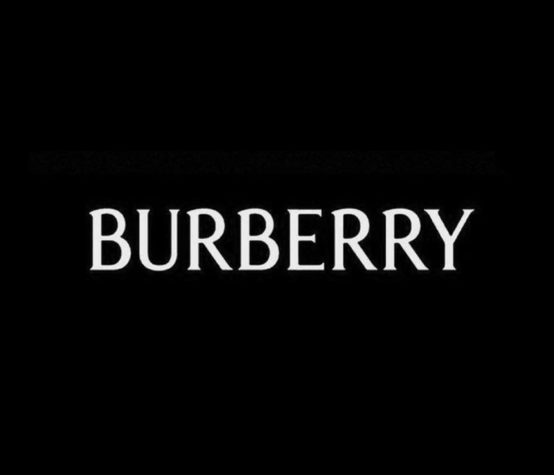
Burberry
Burberry has successfully stood as one of the greatest luxury brands in the world. Their brand identities have mostly carried Serif Typefaces from the beginning, until 2018, when the company adopted a Sans Serif Heavy look. This might have been done to show their competitive trait during the race of constant change. However, Burberry has once more brought back its Serif look, which is thinner and smarter than all its previous logos.
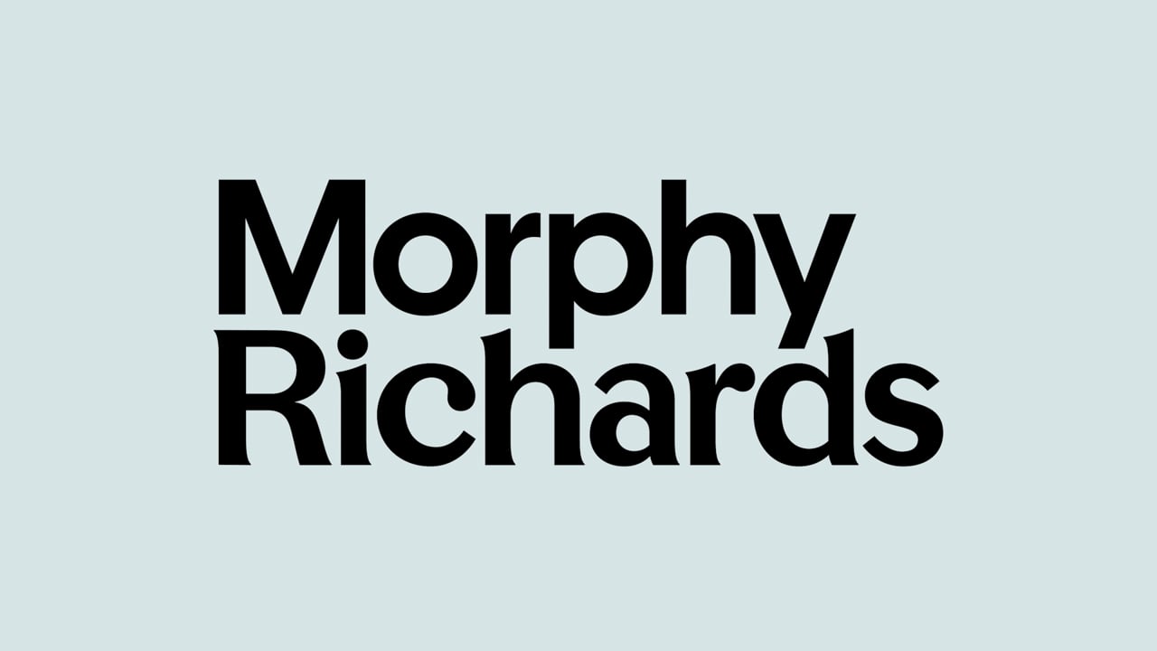
Morphy Richards
Morphy Richards, a British electrical appliances company, always had a friendly yet bold look, for its logo typeface and the colour red. Now, the brand has transformed its complete visual identity with a Matured appearance, with a new word mark that has a colour combination of Light Teal and Black, with slight Serif finish.
The time that we are passing through, has been demanding constant change of design for almost every industry and company type. That’s one perspective to look at. This also unveils the truth that good design is timeless and such insights have been covered in this post, where companies have either been using one logo or similar styles for more than a decade or are going back to their original states after a while.